
Introduction
Steps2Wellbeing is an organization providing mental health services, including signposting, self-help, guided self-help, CBT, and counseling, delivered through telephone, webinars, courses, online consultations, and face-to-face sessions. An initial assessment, conducted via telephone or in-person, is required before accessing services. This usability test, conducted using a cognitive walkthrough, identifies usability issues on the Steps2Wellbeing website and provides design recommendations to enhance user experience.

Context of Use
Demographics
Age Group: Primarily older and middle-aged users.
Over 50% of traffic from users aged 51–100 years.
Approximately 25% from users aged 21–50 years (2020 analytics).
Location: Dorset and Southampton.
Majority of traffic originates from these areas, with offices located here for face-to-face consultations.
User Characteristics: Older users may face challenges with computer literacy, impacting their ability to navigate the website comfortably.
Prioritized Webpages
Based on the demographic assessment, key webpages were prioritized for usability testing, focusing on scenarios relevant to mental health service access and resource navigation.
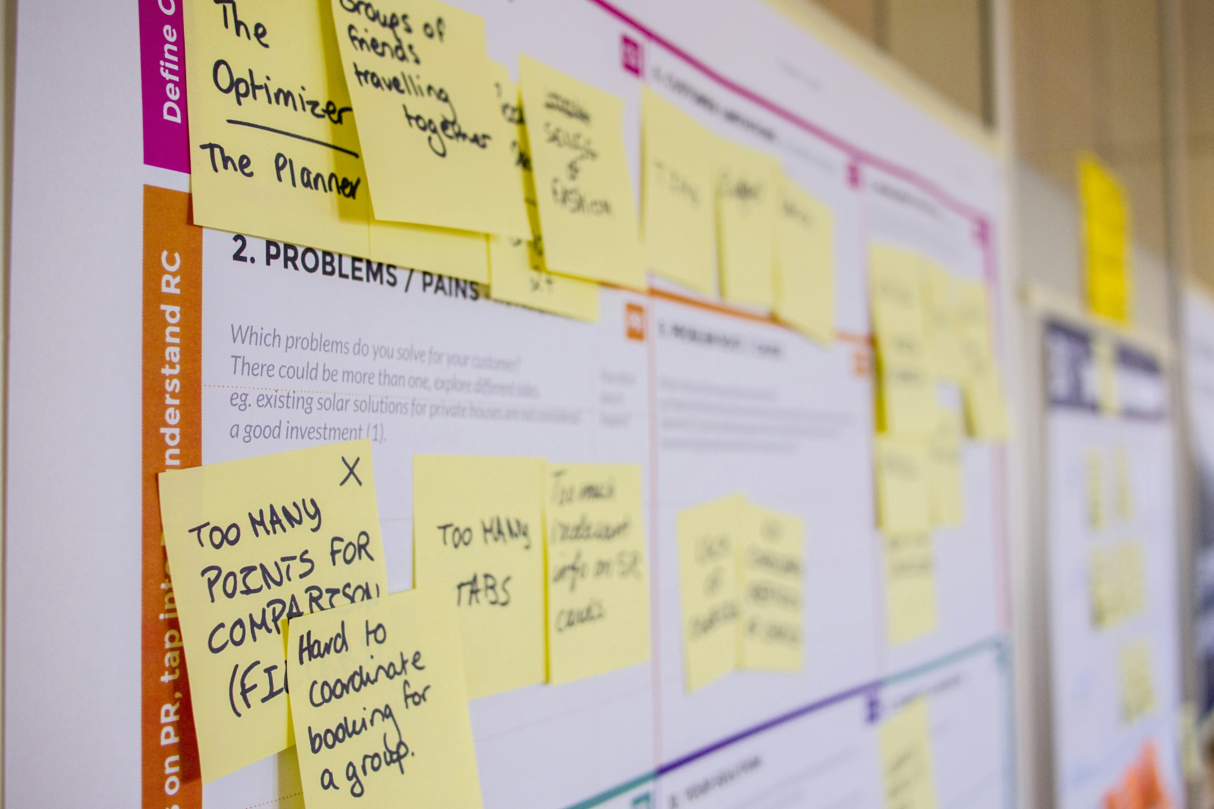
Persona
The target users are individuals with mental health concerns, such as anxiety or depression, seeking services or resources. They vary in age but are predominantly older, with potential limitations in digital navigation skills.

Methodology
Usability Testing Method
The Cognitive Walkthrough method, developed in the 1990s, was chosen for its effectiveness in evaluating user experience through task-based discovery. This method involves observing users as they perform tasks to achieve specific goals, identifying usability issues based on their interactions.
Sample Size
Participants: Six individuals with similar psychological issues, representing diverse age groups to assess timing and comprehension.
Session Length
Each session lasted approximately 50 minutes:
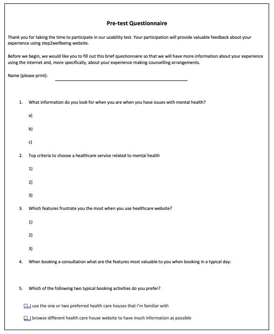
Welcome and Pre-Test Questionnaire: 5 minutes
Task Scenarios: 30 minutes
Post-Test Questionnaire: 15 minutes
Test Procedure
Restrictions: Participants were prohibited from using external search engines or resources to ensure unbiased interaction with the website.
Overview (10 minutes): The moderator welcomed participants, explained the test, obtained consent, and administered a pre-test questionnaire to gather participant information.
Scenarios (30 minutes): Participants completed tasks while the moderator recorded issues, timing, and observations.
Closing (5–10 minutes): Participants completed post-task and post-test questionnaires for immediate feedback.
Scenarios and Tasks
Find Information About Services/Therapies
Locate services offered by Steps2Wellbeing.
Identify the procedure for mental health assessment.
Explore types of initial assessment methods.
Find patient success stories.
Find Information About Mental Health Issues
Locate information on mental health illnesses and symptoms.
Find Self-Help Resources
Access online courses, webinars, forums, workbooks, COVID-19 resources, and mental health apps.
Contact the Center for Assessment
Find contact information and center address.
Schedule a video call for initial assessment.
Access updates about the center.
Self-refer, refer another patient, or cancel/modify an appointment.
User Task Assessment Criteria
Does the user understand how to start the task?
Are controls conspicuous?
Is the correct control identifiable?
Is feedback provided to indicate task completion?
Was the task completed successfully?
User comments on the experience.

Key Usability Issues
Mental Model
Self-Referral Title: The term "Self-Referral" is unintuitive for booking assessments, confusing users expecting an "Appointment" label.
Header Categories: Overly complex and unclear categories in the header section hinder navigation.
Self-Referral vs. Refer a Patient: These options are not grouped together, causing confusion.
Navigation
Deep Hierarchy: The "Area Info" section has a complex structure (e.g., Home > Area Info > Southampton > Southampton City), making it difficult to navigate.
Feedback
Webinar Section: Lacks a clear "Access" button, leaving users uncertain about how to proceed.
Key Findings and Severity Ratings
Findings are evaluated against Nielsen’s 10 Usability Heuristics and assigned severity ratings (1–4, where 4 is critical).
Issue | Description | Heuristics Violated | Severity | Recommendation |
|---|---|---|---|---|
1 | Too many header categories confuse users. | Recognition rather than recall, Consistency and standards | 4, 3 | Reduce categories to three: Services, Getting Help, Mental Illnesses. |
2 | Mental model mismatch for icons (e.g., “How are you feeling?”). | Match between system and real world | 2, 1 | Use icons that align with section titles. |
3 | Deep hierarchy in "Area Info" is unintuitive. | Recognition rather than recall | 4, 3 | Simplify navigation structure; prioritize resources on the homepage. |
4 | "Area Info" title is misleading for resources. | Match between system and real world | 4, 1 | Replace with a map or clearer title like "Local Resources." |
5 | No clear CTA for webinars and video consultations. | Visibility of system status | 4, 3 | Add prominent "Access" buttons with availability indicators. |
6 | Redundant resource locations (e.g., courses, webinars). | Consistency and standards | 2, 3 | Consolidate resources into a single section. |
7 | Video consultation CTA is hard to find. | Recognition rather than recall | 4, 1 | Create a visible, dedicated button. |
8 | "Self-Referral" title misleads users. | Match between system and real world | 4, 1 | Rename to "Book Appointment." |
9 | Inconsistent CTA for self-referral ("Click here to start"). | Consistency and standards | 3, 1 | Standardize button titles across pages. |
10 | "Refer a Patient" is hard to locate. | Recognition rather than recall | 3, 2 | Place in the same section as self-referral. |
11 | Search fails to account for user mental models or spelling errors. | Match between system and real world | 2, 4 | Optimize search to correct spelling and align with user expectations. |
12 | Small search bar size is inaccessible for older users. | Flexibility and efficiency of use | 2, 1 | Increase search bar size for accessibility. |
13 | "Employee Support" title is misleading. | Match between system and real world | 2, 1 | Rename to reflect content, e.g., "Workplace Support." |
Too many Categories in header section confusing the user
Resources are in the deep hierarchy which are not intuitive and difficult for user to navigate Resources are in the deep hierarchy which are not intuitive and difficult for user to navigate

Resources are in the deep hierarchy which are not intuitive

Self-Referral Button is not consistent

The search is not optimized to the user’s mental models

Completion Rates and Time on Task
Completion Rates (1 = Completed, 0.5 = Half Completed, 0 = Failed):
Scenario 1: Average completion rate varied, with issues in header navigation and unclear information.
Scenario 2: Mental health information was difficult to locate due to presentation format.
Scenario 3: Contact tasks were generally easier, but header confusion persisted.
Scenario 4: Self-referral and referral tasks had low completion rates due to unclear CTAs.
Time on Task: Tasks with deep hierarchies or unclear CTAs took longer, particularly for older users.
SUS (System Usability Scale) Insights
The SUS score (to be calculated post-test) will reflect user satisfaction, with lower scores expected due to navigation and mental model issues.
Recommendations
Simplify Navigation:
Reduce header categories to three intuitive sections.
Flatten the "Area Info" hierarchy and prioritize resources on the homepage.
Improve Mental Model Alignment:
Rename "Self-Referral" to "Book Appointment" and group with "Refer a Patient."
Use icons and titles that match user expectations.
Enhance Accessibility:
Increase search bar size for older users.
Optimize search to handle spelling errors and user intent.
Add Clear CTAs:
Include prominent "Access" buttons for webinars and video consultations.
Standardize button titles for consistency.
Consolidate Resources:
Group courses, webinars, and workbooks into a single, easily accessible section.
Conclusion
The cognitive walkthrough revealed critical usability issues in the Steps2Wellbeing website, particularly in navigation, mental model alignment, and feedback. Implementing the recommended changes will enhance accessibility and user experience, especially for older users seeking mental health services.